|
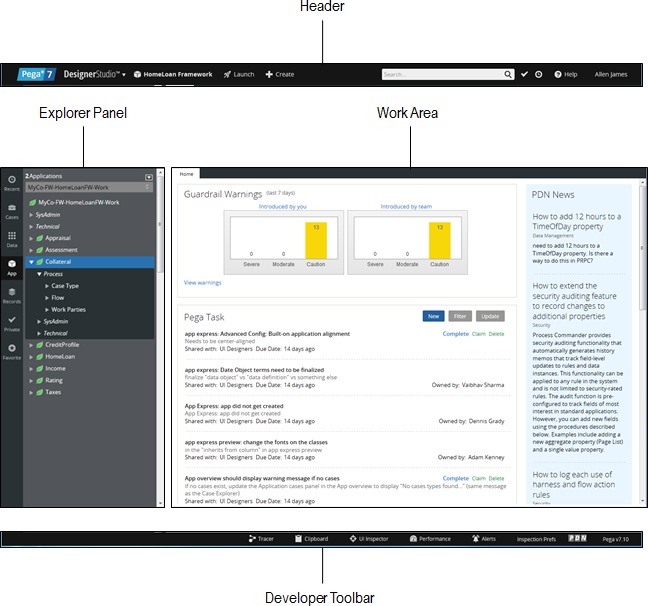
Now localizable and accessible from a variety of browsers, the Pega 7 Designer Studio provides a rich developer experience that is optimized for ease of use. A complete redesign puts intuitive tools at the forefront to simplify the design experience and enable you to quickly build enterprise scale applications. This article gives a tour of the Designer Studio, highlighting its major functions and new features. Designer Studio groups elements consistently and logicallyThe Pega 7 Designer Studio clearly presents the required information and tools to perform work in any context. Primary user actions have been promoted to the top level menus for greater visibility. Explorer navigation is streamlined with greater control over configuration and display of data. Developer tools are centrally located and display based on role. Complexity and visual distractions have been eliminated to provide a modernized yet cohesive experience. There are four main components of the Designer Studio as illustrated below
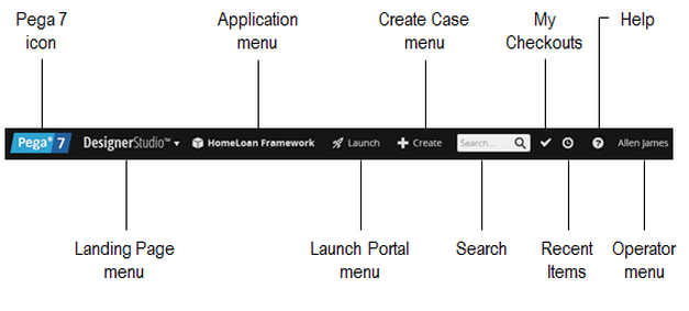
About the Designer Studio HeaderThe Designer Studio Header is organized to make frequently used items accessible and keep navigation simple. Each component is detailed below: Pega 7 icon
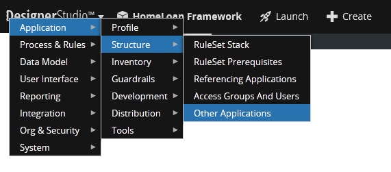
Click the Pega 7 icon to load the Home Page in your Work Area. The Home Page displays guardrail warnings for your application and facilitates task assignments between you and operators in your associated access groups. Landing Page menu Click the Designer Studio logo to access landing pages, wizards and tools to build your application. Although not an entirely new feature in Pega 7, the landing page structure has been reorganized and enhanced to better align with application development needs. The Landing Page menu is grouped by functionality and presented in tiers. Navigation is from left to right as illustrated below. |
Categories
All
Archives
October 2020
Categories
All
|
Services |
Courses OfferingPega System Architect ( CSA ) 8.4
Pega Senior System Architect ( CSSA ) 8.4 Pega Lead System Architect ( CLSA ) 8.4 Pega Business Architect ( PCBA / CPBA 8.4 Pega Decision Consultant ( CPDC ) 8.4 Pega Marketing Consultant ( CPMC ) 8.4 Pega Data Scientist ( CPDS ) 8.4 Pega UI Specialist ( PCUIS ) Pega Testing Pega Administation |
CompanySupport |
AddressIndia
Nizampet Rd, Jai Bharat Nagar, Nagarjuna Homes, Kukatpally, Hyderabad, Telangana 500090 USA Greater New York City Area New York -14624 United States |
© Copyright 2011 - 2020. All Rights Reserved.
|
PegaGang all rights reserved. All PegaGang training materials is proprietary content of PegaGang. We Dont Use / Distrubute / provide / Install Pegasystems Materials and Softwares. PegaGang is not an affiliate of Pegasystems. PEGA is a trademark of Pegasystems. Pegasystems is not the publisher of the training material and is not responsible for it in any aspect.


 RSS Feed
